Topography of Violence
How can acts of violence be visualized in an appropriate manner? Jews, Jewish institutions, and Jewish-owned firms and stores in the German Reich were subjected to increasing violence long before 9 November 1938. In cooperation with the Urban Complexity Lab Potsdam and the Jewish Museum in Berlin, the project developed visualizations that present information about the dates and locations of many different acts of violence that took place between 1930 and 1938.
- Year 2020
- Context Research project, Urban Complexity Lab, FH Potsdam & Jewish Museum Berlin
- My Role
- Link Open visualisation
The project forms part of ongoing historical research that examines allegedly spontaneous manifestations of growing antisemitism before the Holocaust. From 1930 onward, and especially in the period from 1933 to 1938, the Nazis used racist slurs, antisemitic legislation, and violent assaults to threaten Jews on a local level and to exclude them from social, economic, and cultural life. As a result of this violence, which occurred in several waves, many of Germany’s two thousand Jewish communities ceased to exist by 1938.
The data set used for the project draws from contemporary sources and from extensive local, regional, and national studies carried out over the past seventy years. The research project subsequently focused on the question of how insightful, deliberate and ethical visualization forms can be found along interactive modes, enabling an animated overview and interactive exploration as well as the participatory enrichment of the data set. The results are an animated wall map and media station, which are integrated into the new permanent exhibition of the Jewish Museum Berlin, as well as a web-based visualization.
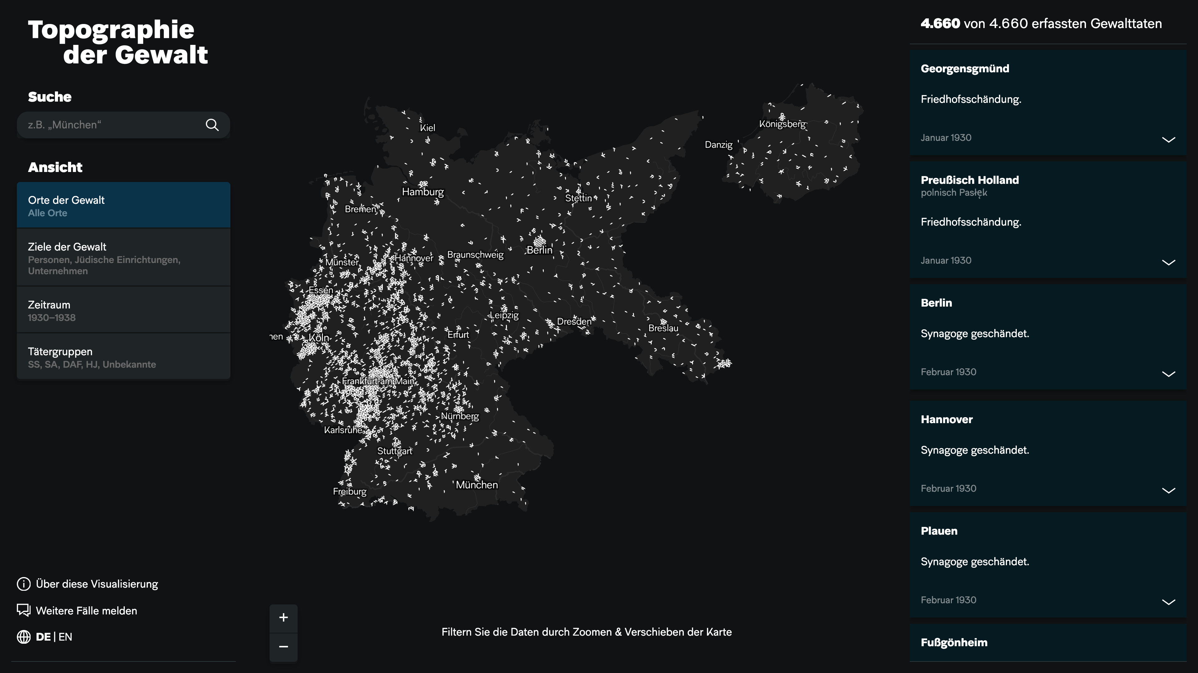
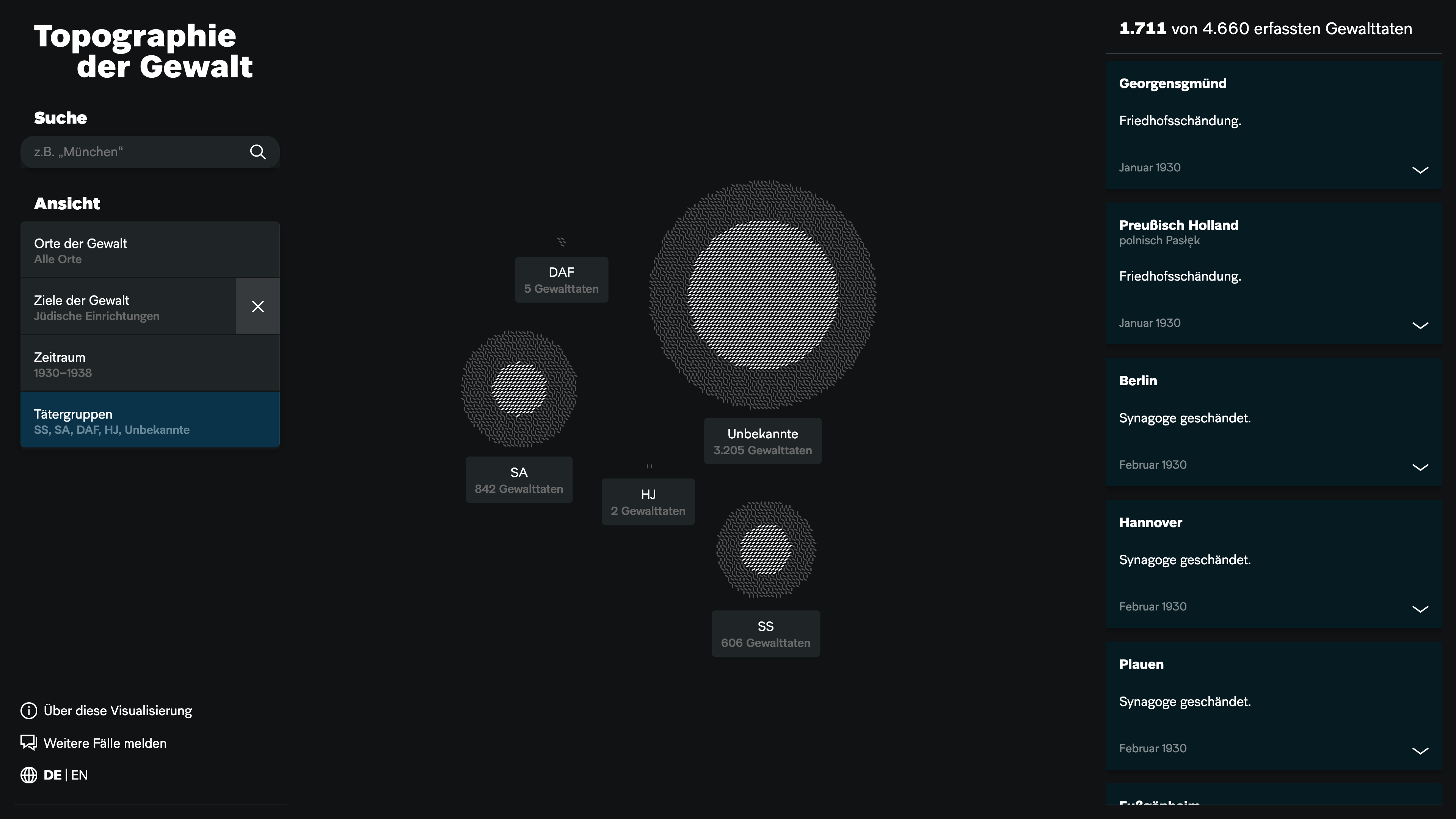
The visualization gives an overview of the acts of violence with their dates, locations, and perpetrators. The targets of violence are divided into three categories: individuals, Jewish institutions (synagogues, cemeteries, community institutions, private associations), and businesses (firms and stores). While the visualization does not provide a finalized or exhaustive survey of cases, visitors can search for particular places, years, or perpetrator groups. They are also invited to expand and enrich the data set by contributing their own knowledge of local incidents of violence.
The project was a research collaboration between the Jewish Museum Berlin Foundation and the UCLAB, with the assistance of the House of the Wannsee Conference memorial and educational site. The data presented in the visualization are based on research by the Jewish Museum Berlin and by Marc Grellert of the Digital Design Unit, Technical University of Darmstadt.
Media Coverage
The Berlin-based Tagesspiegel published an interactive feature, covering the research project and the visualisation: „So wurde die Gewalt zum Flächenbrand“ (German).
The Frankfurter Allgemeine Zeitung reported about the map in their article „Wo bleiben Stolz und Zorn?“ (19.08.2020):
A media station depicts the riots against Jews over time through small flashes on an outline map of Nazi Germany. Until November 1938, the bolts of lightning concentrate on the Rhine, Main, and Moselle rivers, in the Ruhr area and Berlin, then suddenly they fire across the entire country. Libeskind's tilted windows band runs through the middle of the media station. If there is an intellectual climax to the exhibition, then it lies right here, in the visual and expressive condensation of history.
(translated from German)
See more projects:
Say Hello!
You've got a question or want to talk to me? Drop me a mail.