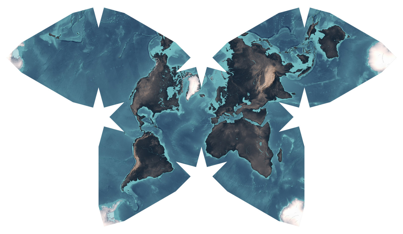
Butterfly Map
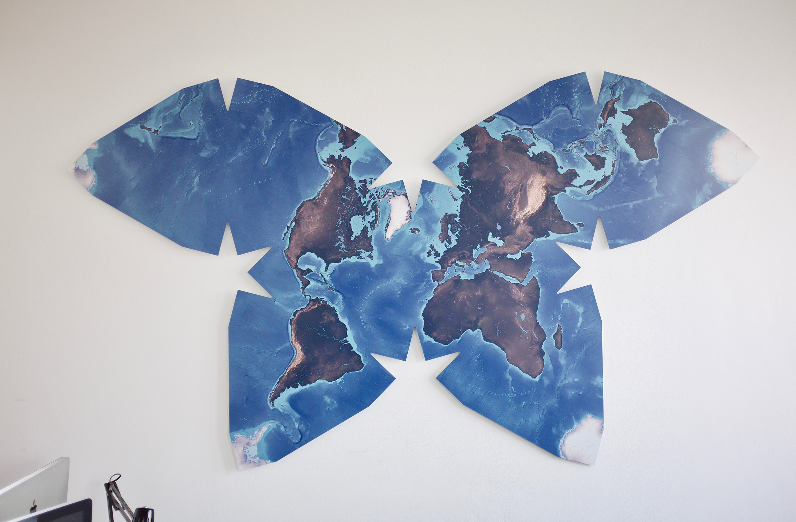
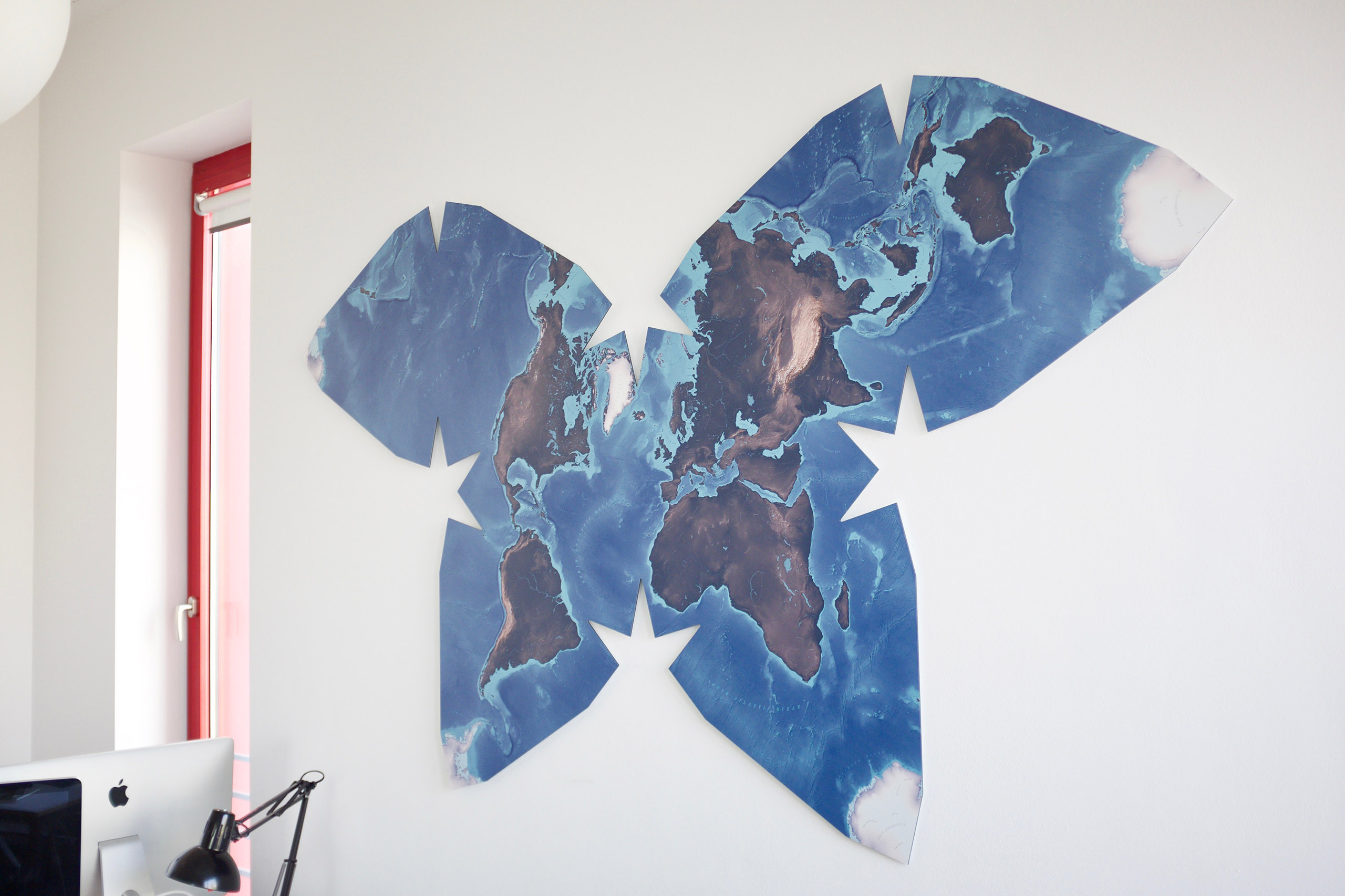
A printed world map based on a butterfly projection, created using only open source data and mainly open source tools. It is two and a half meters wide, displays Earth in a natural-inspired but abstracted color scheme and features hillshades and beautiful typography.
This project was a cooperation with Prof. Boris Müller.
- Year 2019
- Context Commissioned Project, University of Applied Sciences Potsdam
- My Role
- Link Documentation
Challenge
This project was challenging in many ways: Common cartographic applications do not support butterfly projections. Many open source data sets lack in quality or accuracy. There is no defined, ready-to-go cartographic process to design such a map.
Consequently, I had to develop specific solutions to create such a map from scratch, using only open source data and mainly open source software or common graphic design applications.
This is an overview of this project. I wrote more about the technical process in a detailed documentation. If you are interested in our motivation, please also read Boris Müller’s related essay “How to Make a Beautiful Map”.
Technical Setup
The rendering was done using node.js, D3, the D3 geo projection package and node-canvas. Multiple data sets have been used during this project—including data sets from Natural Earth and ETOPO1.
I bundled all the scripts that I used during this project in the library “Haacker”. It is available on GitHub.
Cartographic Design
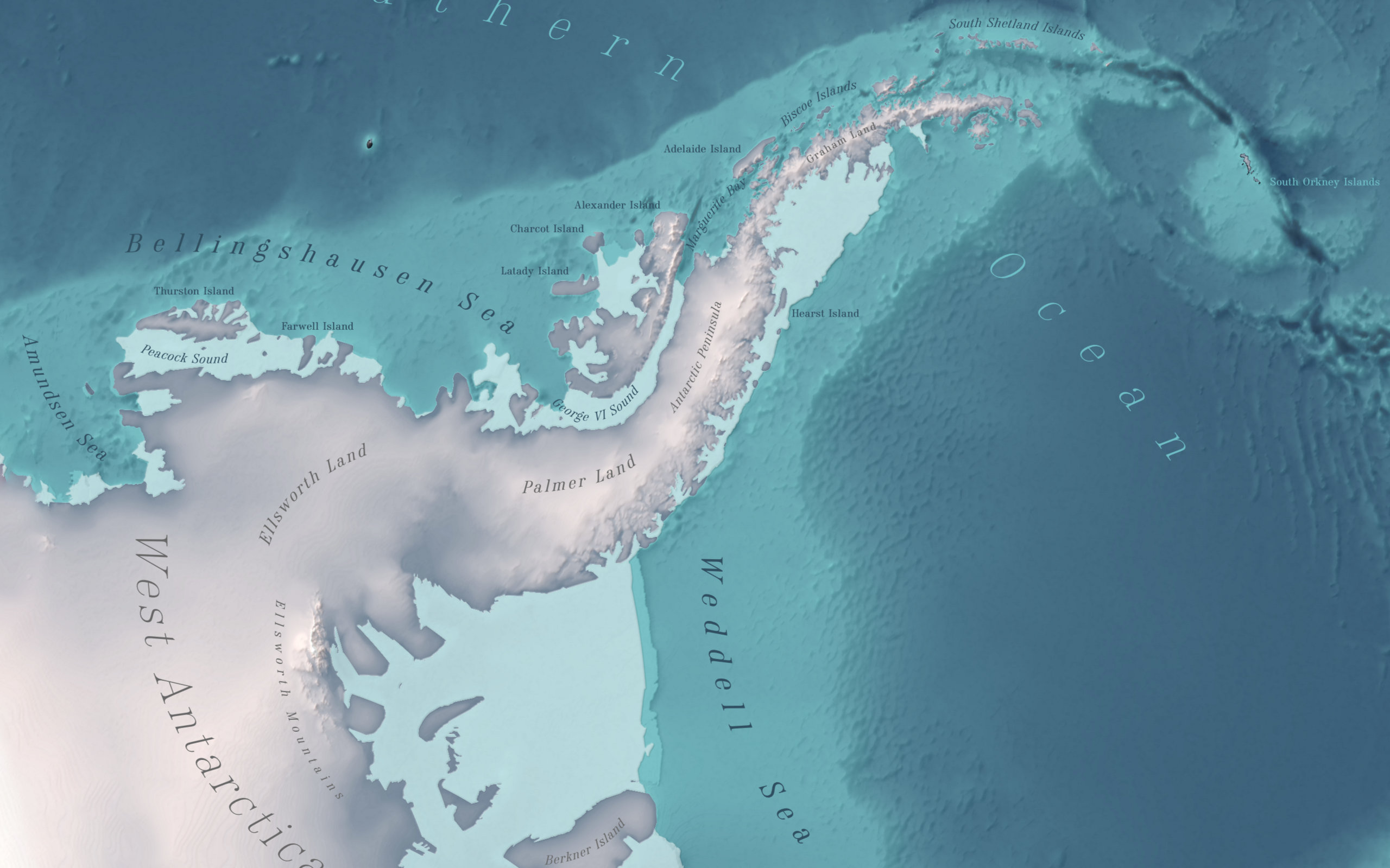
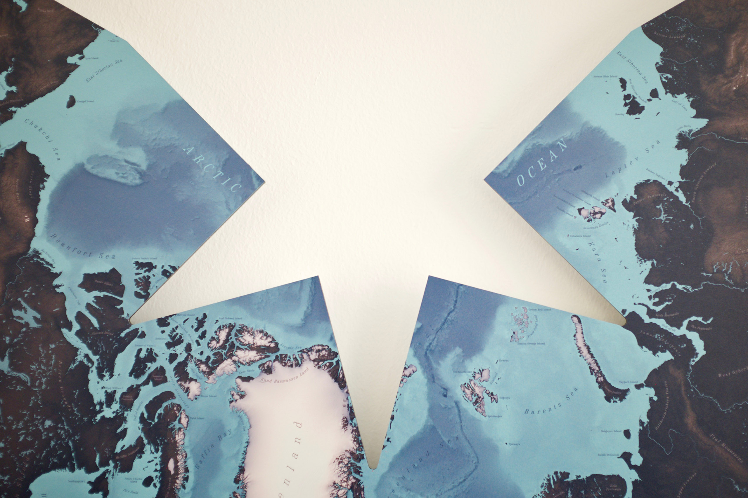
The map features layers for bathymetry, topography, rivers and lakes, deltas, snow and ice and Antarctic ice shelfs. In addition, there are two hillshade layers and a layer of map labels.
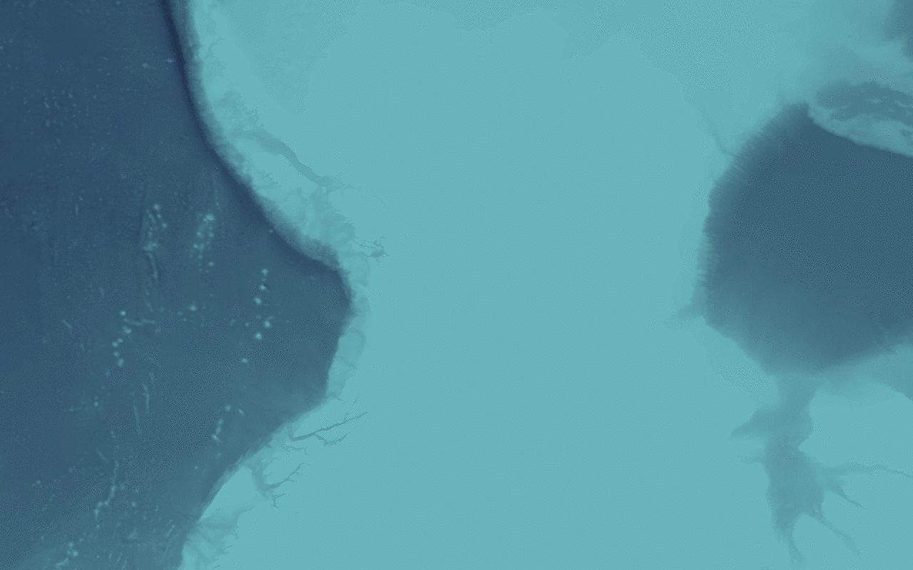
Hillshades—both for the bathymetry and topography—have been rendered in Blender and blended into the underlying map layers. They add a feeling of depth to the map and make the relief visible.
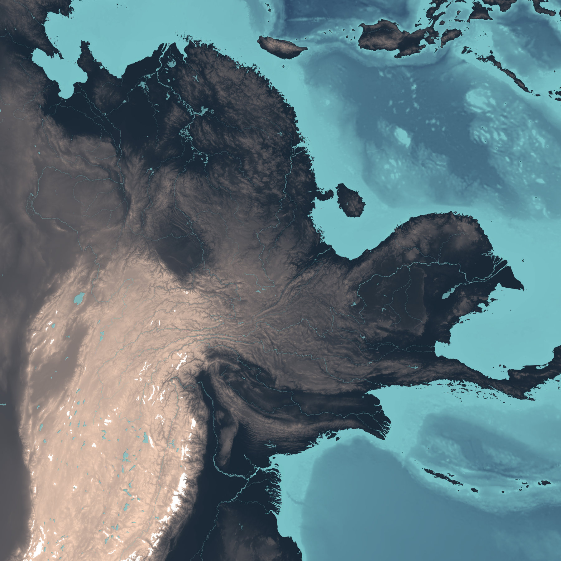
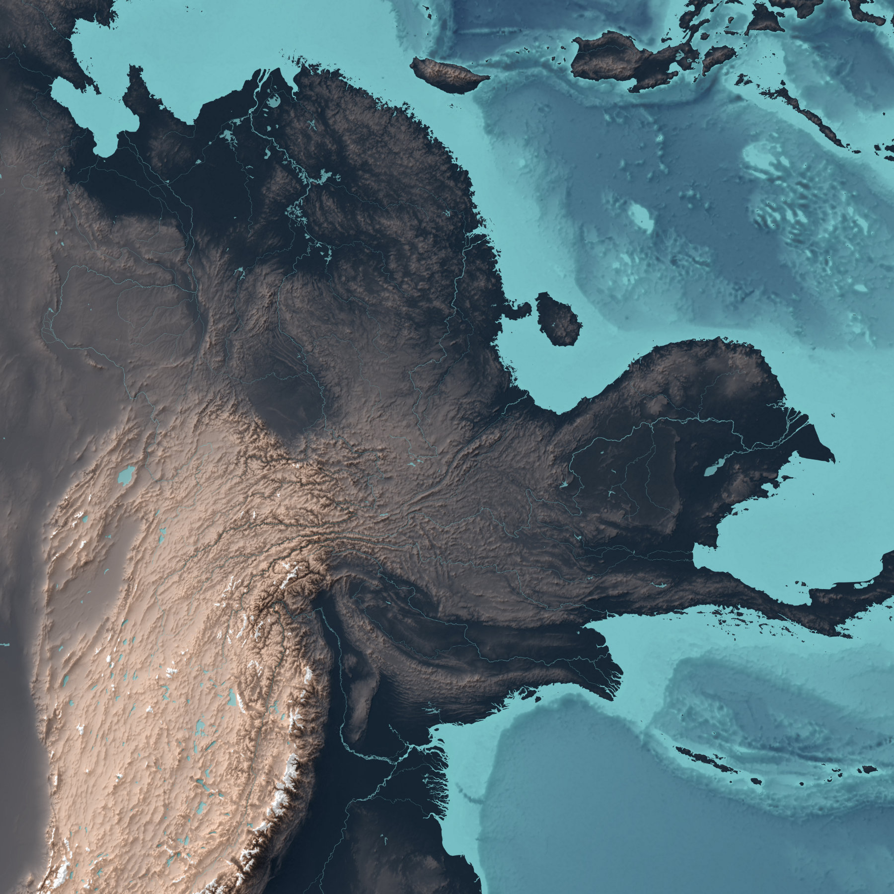
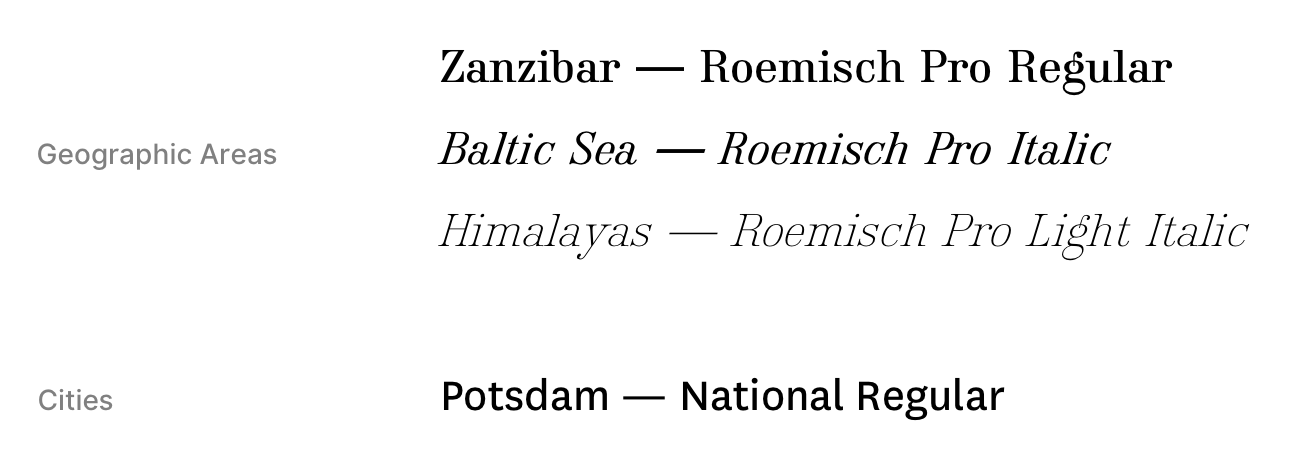
As a final layer, more than 1.000 labels were placed on the map. They are set in two different font families and mostly positioned manually.
Result
The map is two and a half meters wide, was printed on an aluminium composite panel and later laser cutted using a vector outline. It finally found its home inside of the University of Applied Sciences Potsdam’s Urban Complexity Lab.
See more projects:
Say Hello!
You've got a question or want to talk to me? Drop me a mail.