City in Flux
A visualization that features the informal and formal mobility networks in Cape Town. It reveals hidden patterns and dividing lines throughout the city and tells meaningful stories that help to understand the developments in the city's physical and social mobility networks.
- Year 2018
- Context Course project, University of Applied Sciences Potsdam
- My Role
- Award CityVis 2018 — Runner-up (student competition)
- Link Prototype
Challenge
In the year 2050, 2.5 billion people will live in an urban area. African and Asian cities are particularly re-shaping and naturally, such transformational processes have an effect on (social) sustainability, life quality and the need of finding new ways of organizing life and infrastructure. Cape Town is a diverse city which is overall transforming—a City in Flux. The city’s mobility infrastructure is based on two major services: public bus lines and informal shared mini taxis. Together, they form a network of over 800 lines throughout Cape Town.
Our goal was to design a data visualization that explains Cape Town's mobility infrastructure in relation to the city's social-demographic divide. In addition, the visualization should allow people to learn about their city and support them in shaping it through social innovation.
Design Process
This project was developed during a data visualization design course at the University of Applied Sciences Potsdam. It was based on a cooperation with WhereIsMyTransport—the company provided us with the mobility data we used in the project.
During our design process, we developed several prototypes and rough tools that helped us to explore the data and sharpen our ideas for the final visualization. We also gathered feedback from residents of Cape Town to check if our visual model represents the city in a useful way from there point of view.
Storytelling
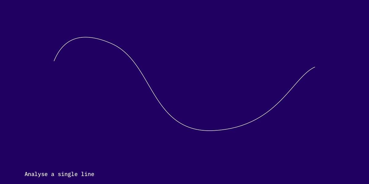
We decided to split our visualization between the geospatial data on the map and the underlying data and analysis onto multiple screens. Like this, we prevent to mix up the different layers of information and communicate the structure to the users in a clearer way. Our final storytelling concept therefore follows the information seeking mantra for information visualization by Ben Shneiderman:
»Overview first, zoom and filter, then details-on-demand« (1996).
Users start with an overview of all routes in Cape Town before they select a route to analyze it further.
Visual Design
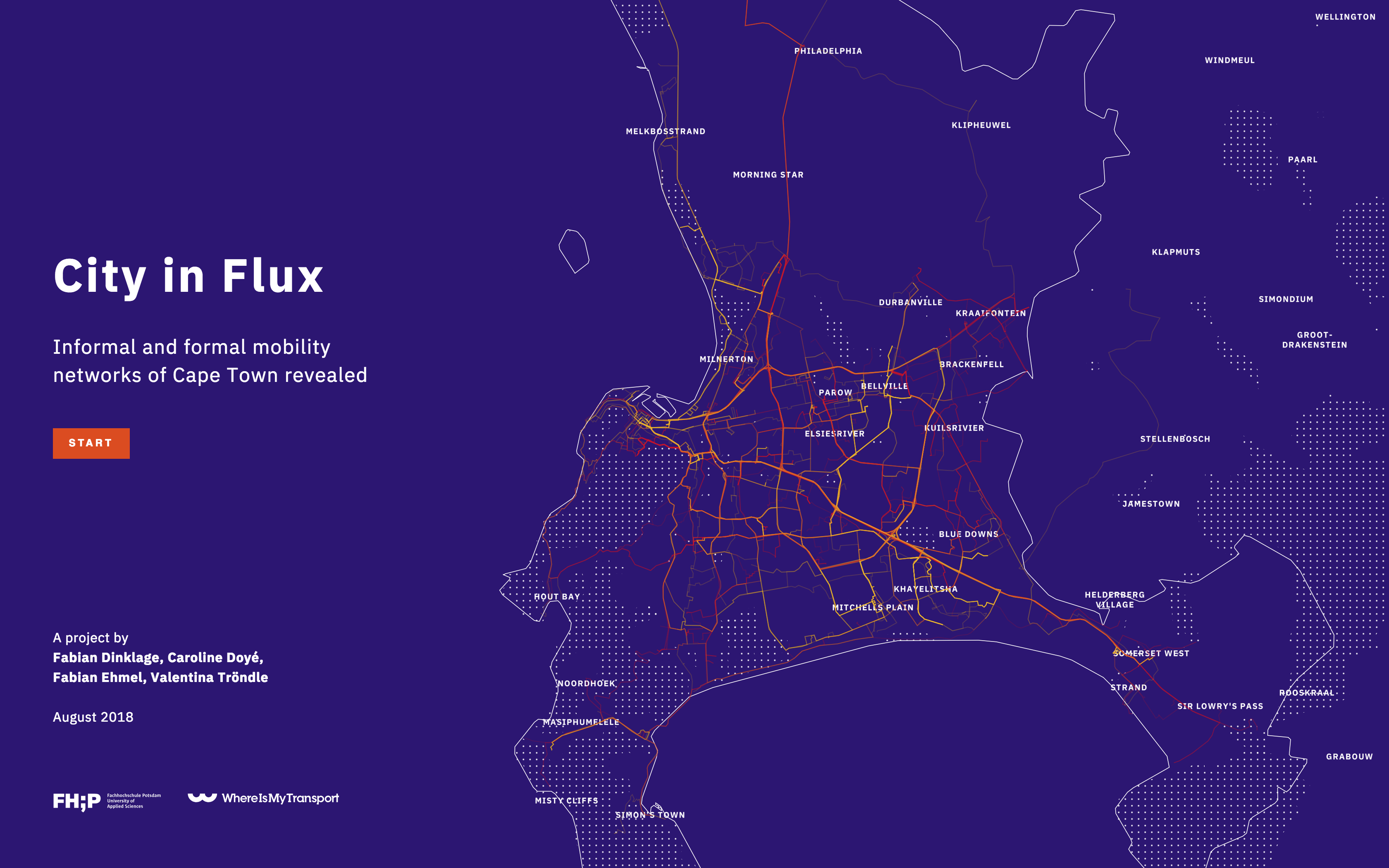
The choices of color palettes and the font family were driven by functional aspects like contrast and readability. We consciously decided to add an unique character to the map layer by defining a strong and vibrant color palette to it. Along with the contrast of the »urban divide« we tried to visualize this phenomenon as a part of the visual language as well.
Data Processing
The visualization is based on two datasets from two separate sources: mobility data, provided by WhereIsMyTransport and census data, provided by Statistics South Africa. We merged these two datasets during our process and created a single dataset that we could use in our visualization.
The data pipeline consist of several steps: First, we routed all the 800 routes along their stops to be able to display them as lines on the map.
Second, the process of combining the resulting routes and the census datasets was done in multiple steps:
We generated a set of intermediate points along each route and overlapped these with the census district.
Afterwards, we could calculate each point's social-demographic and social-economic values based on it's surrounding census districts.
By combining all points of a route, we could finally calculate the median values for the route itself.
Using this process, we generated a comprehensive dataset that we could use as base for the visualization's implementation.
Result
The final visualization consists of three views that gradually increase the level of detail a user is looking at: overview, detail view, story view.
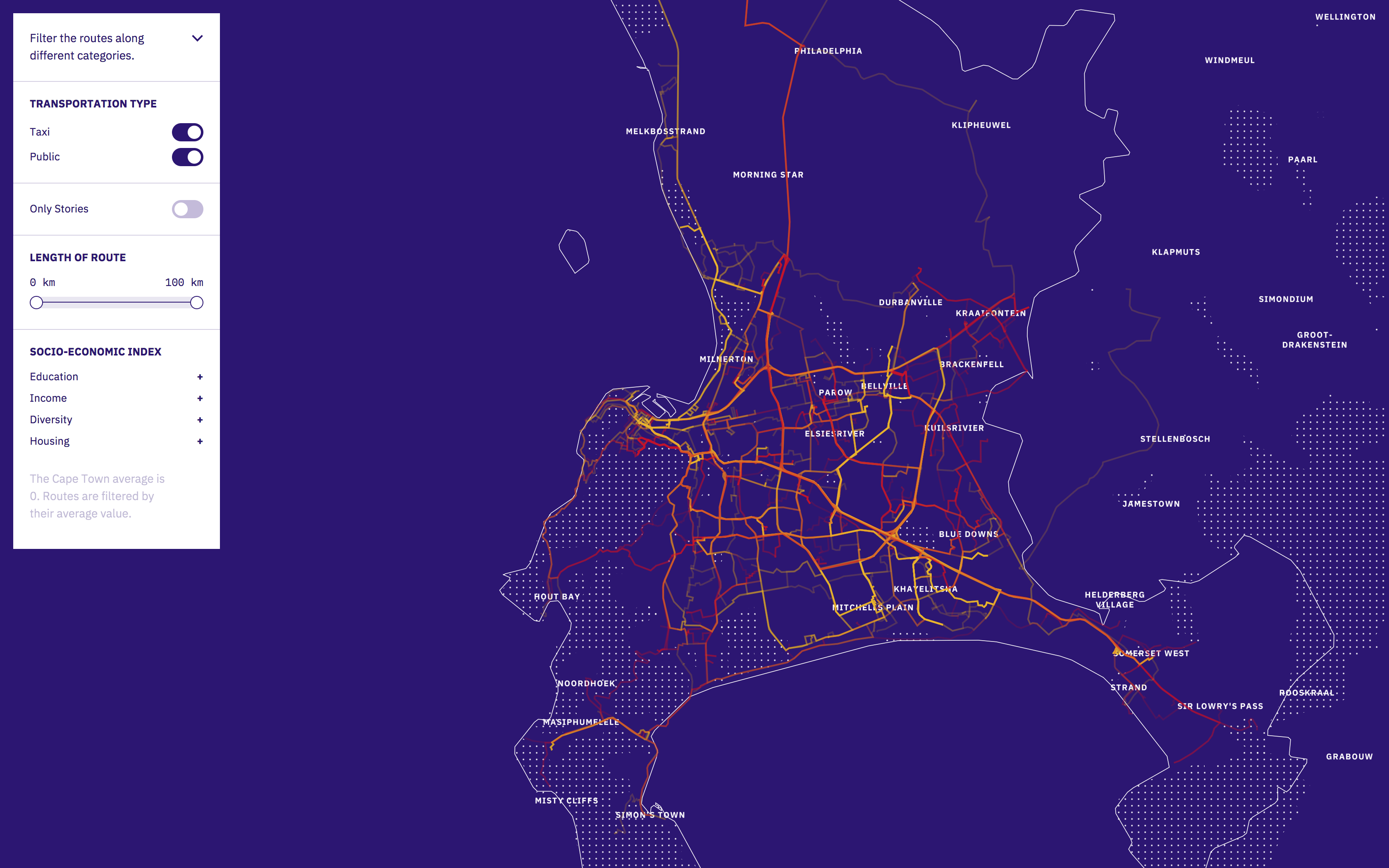
Overview
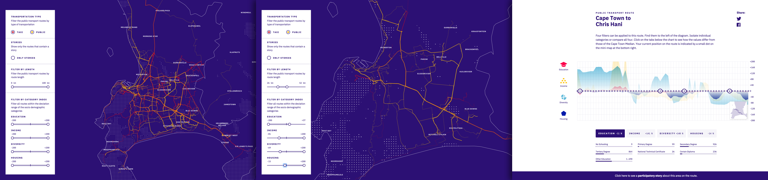
Initially, users see an overview of all routes of transportation in the urban area of Cape Town. The routes can be filtered by their percent based deviation to Cape Town's median along four socio-economic categories: housing, income, education, and diversity. Playing with the filters reveals hidden patterns of the »urban divide«: It provides clear insights of the invisible borders and structural issues the city is facing. Without dealing with the underlying data, the user can deconstruct the societal segregation along the routes, which split the major city.
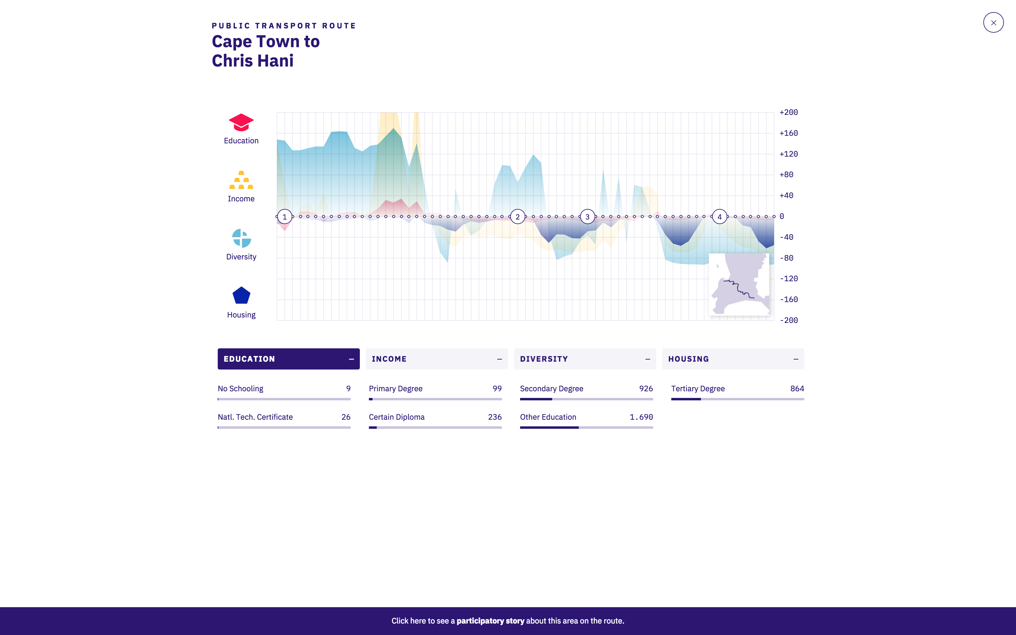
Detail view
Once users select a single route, the app transits in the detail view that focuses on this route's census data. The visual analysis of each category’s deviation to Cape Towns median within the Census Data was communicated via an area graph. To strengthen transparency and trust of our visualization, we added a small group of barcharts to make the interpreted values of the area graph more accessible and show the preprocessed data to the user.
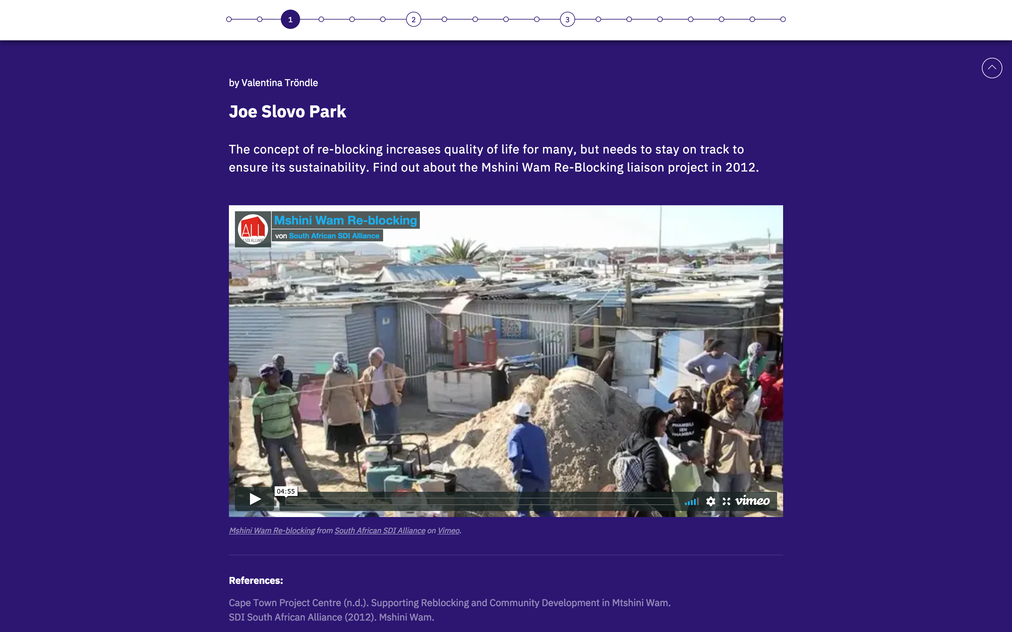
Stories
In the last phase of the concept, we added an »layer of participation« that serves as a platform for user generated content. This layer provides additional editorial information about the selected route. These could consist of a broad range of sources: texts, images, videos or audio snippets. For now, we created stories for two selected routes. Ideally, the stories for additional routes would be provided by local inhabitants of Cape Town in the future.
Protoype
The prototype is accessible online.
See more projects:
Say Hello!
You've got a question or want to talk to me? Drop me a mail.